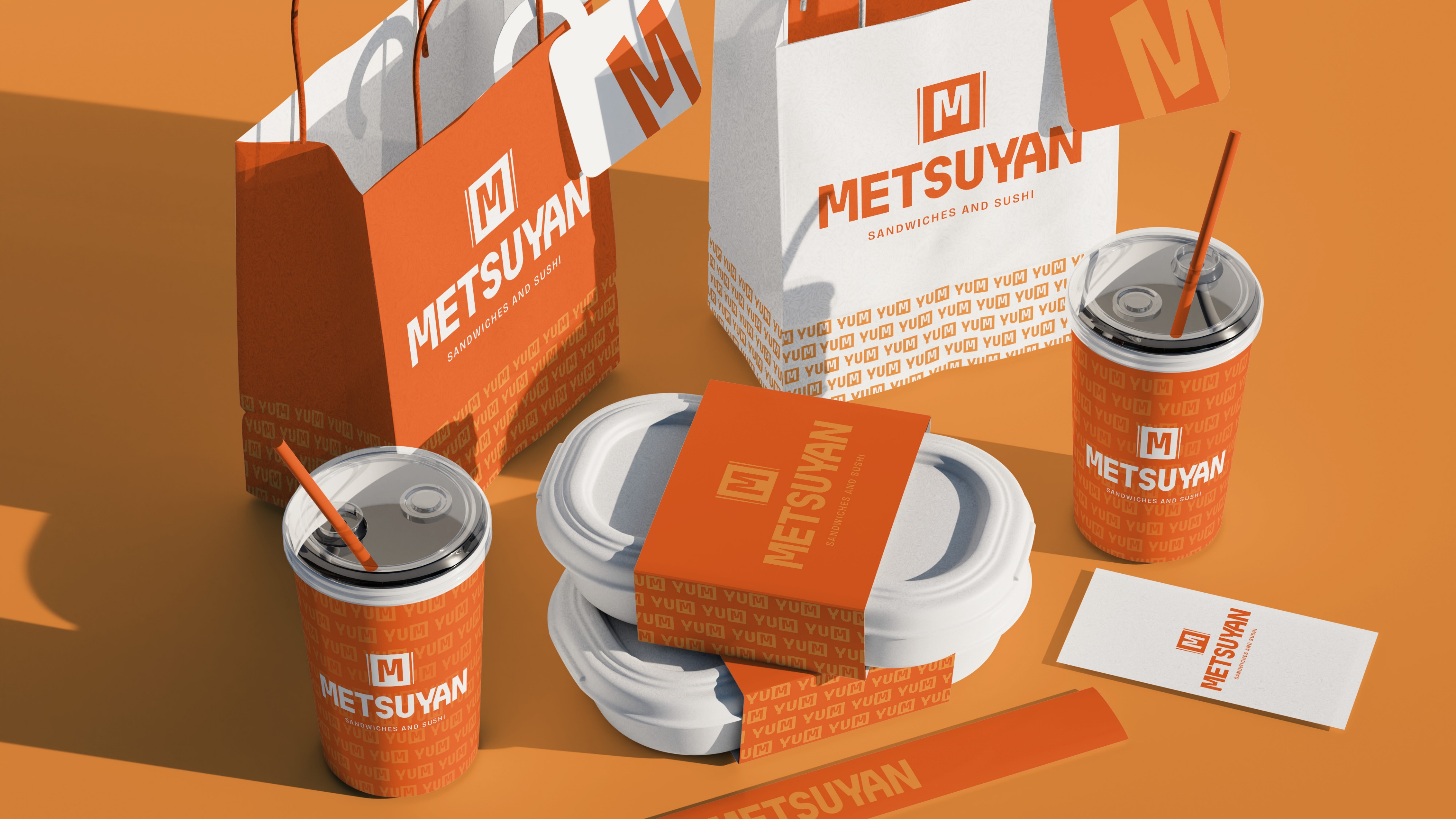
Metsuyan
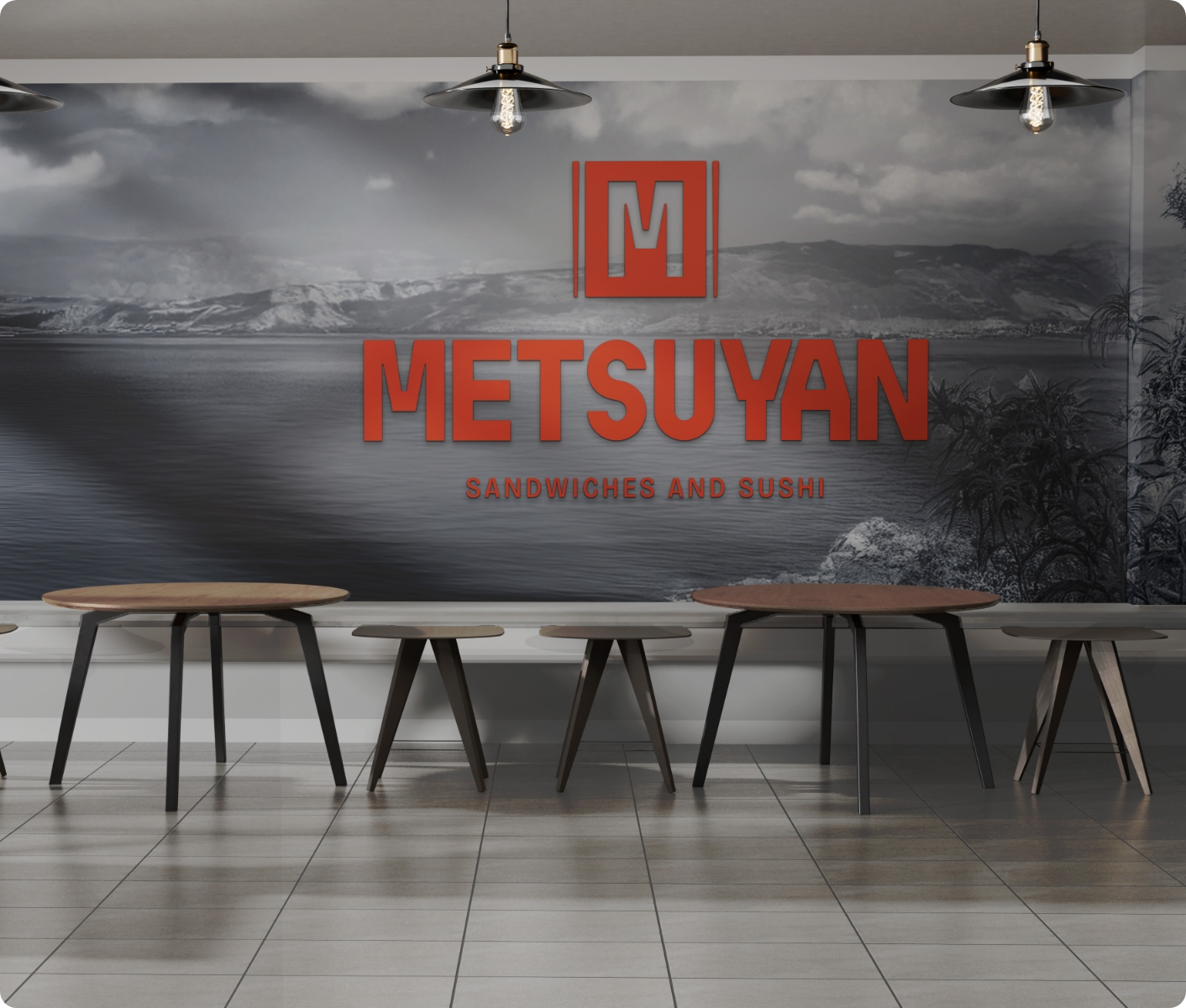
Identity Design
Discovery
A new homey café was about to launch, serving its surrounding community in Antwerp. Offering a fresh sandwich bar in the a.m. and a delicious sushi bar in the afternoon, their reputation for good food would no doubt precede them. All they still needed was a solid brand identity that'll keep them hot in the long run. Our design challenge was clear.
The logo had to evenly balance both the breakfast sandwiches vibe as well as the Japanese sushi vibe.
Indoor & Outdoor Signage
Core Strategy
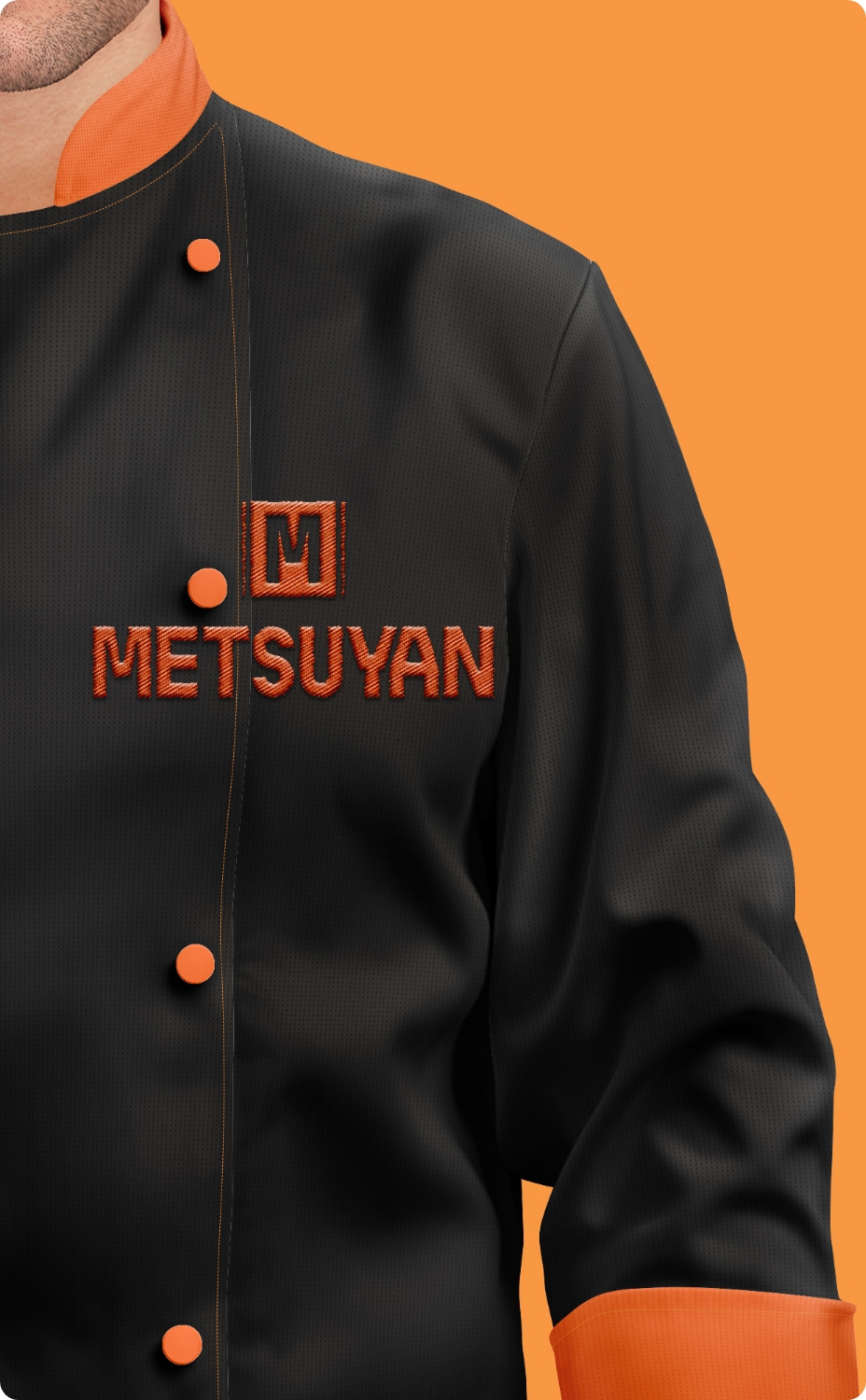
The final logo perfectly hits the right balance. The subtle references to chopsticks combined with some curved letterforms relates without limiting it to sushi.
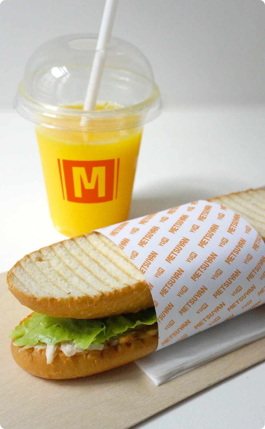
The analogous orange color palette, as opposed to pairing it with green or black, allows it to be appropriate for both sandwiches and sushi.
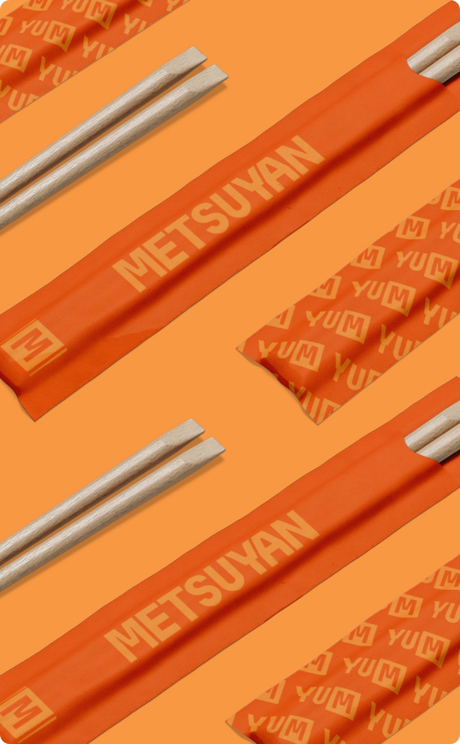
The unique M became a solid brand icon, working well in patterns and more, excellently rounding out the brand.
- Brand Positioning
- Signage
- Package Design
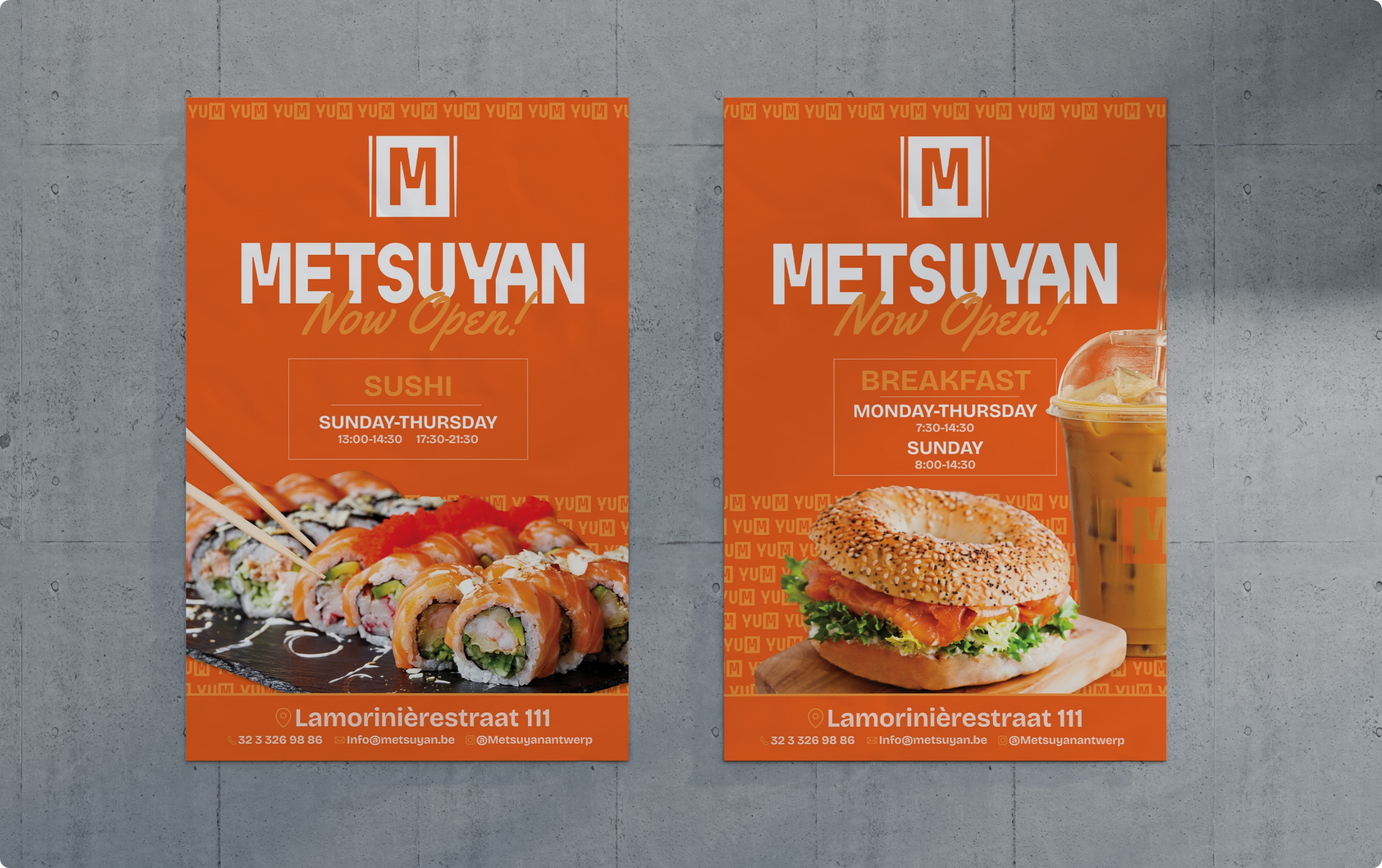
- Advertising
- Strategic Ad Placement
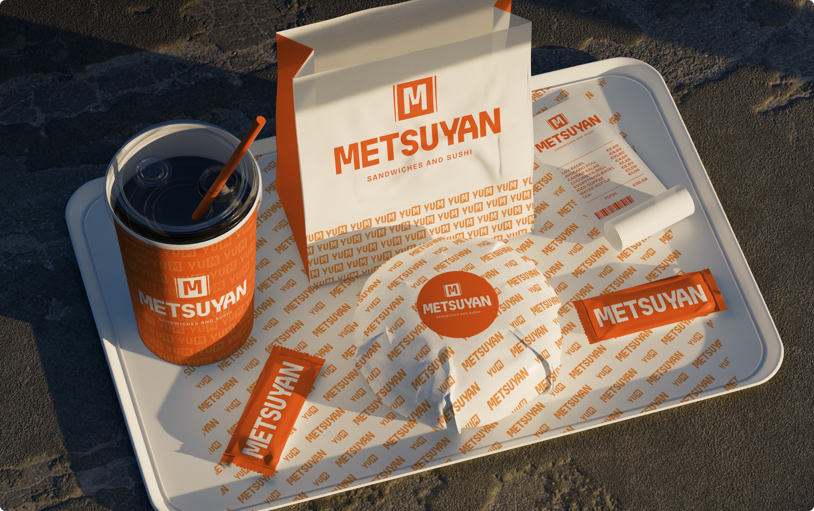
Package Design
Highly recognizable and consistent brand identity